The Hundred-Year Chair · a chapter
Aesthetics, Style, Memphis
The best thing I have ever designed is an ice cream scoop, and the part of it that people call beautiful I did not design at all.
It started, the way these things do, with a small daily insult. Premium ice cream comes out of an American freezer at about the hardness of a hockey puck, and the scoop in the drawer, some stamped-steel spade with a rubber grip, would either bend, skate off the surface, or send a knuckle into the rim of the carton. I am an engineer by temperament, which mostly means I cannot leave a bad tool alone. I worked out two things. The bowl wanted to meet the ice cream at an angle rather than head on, to carve a curl instead of chiseling a crater. And a solid slug of metal in the handle would do quiet thermal work, carrying the warmth of the room and the hand down into the bowl so the leading edge was always very slightly melting its own path. I built the thing that tested both and proved out the ergonomics, on my own hands and a lot of other people's. It worked. It was also ugly. It looked like what it was, a functional prototype made by a man who cared about scooping and not at all about how the scooping looked.
So I did what my whole field is organized around. I took my ugly, correct object to people who do the other half. Lunar Design, founded in Silicon Valley and by then run out of San Francisco, is staffed by exactly the kind of tasteful, unhurried people I am not, and some of them are my friends. They took my angle and my slug of metal and gave the scoop a form: a single fluid sweep of polished stainless, the handle swelling and tapering like something poured rather than machined, the whole object reading as one gesture. They did not touch the function. They could not have improved the function. What they did was find, inside the space my function left open, the shape that made a stranger want to pick it up. The split is in the paperwork too, in what the two patents claim if not in who signed them. The scoop carries a utility patent on the scoop rotated relative to the handle, which is mine and which I had working before Lunar was on the scene, and a design patent on the form, which is theirs. One patent for each pair of hands. The inventor lists on both are the usual firm-filed roster of everyone who was in the room by the end, so a stranger reading the signatures would not see the line. I know where it falls because it is my company and I was there for all of it.
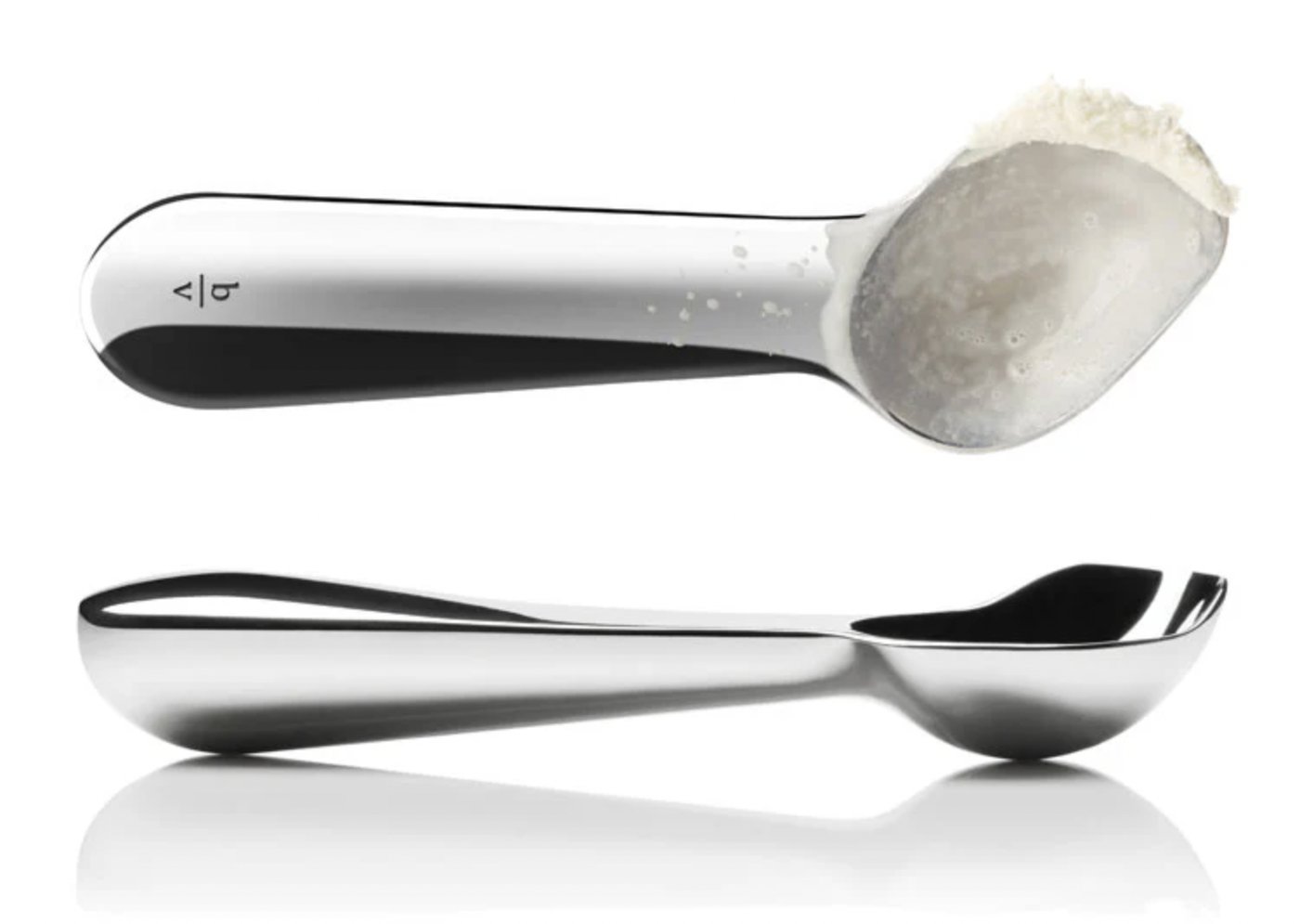
The object did well. It sits in the museum store at the San Francisco Museum of Modern Art. The store is not the museum, a distinction I prefer to make myself. Jerry, of Ben and Jerry's, has bought a few hundred of them, the sort of endorsement an ice cream scoop can actually be proud of. I now own the company. Every time I use mine I am reminded that its beauty and its function came from two different rooms, in that order.
In the theory of aesthetics I have spent years on, I argue that the people who are good at making an object work and the people who are good at making it beautiful are nearly two different species: different training, different studios, different ways of thinking. Most good objects are therefore relays, handed from the first kind of person to the second. The scoop is my own best evidence. Function, then form. Engineer, then designer. It is how the world makes nice things.
Which is why the obvious move, now that the keel chair works, is to pick up the phone and hand it to the same friends who made the scoop lovely. And I do not want to. My reluctance interests me more than anything else. I do not fully trust it.
The respectable reason is real, so take it first. The chair is not the scoop. When I handed Lunar the scoop, I handed them a function wrapped in a wide open space of possible forms; the handle could have been almost anything, and their whole contribution lived in that freedom. The chair does not have that freedom to give. I did not start it with a mood or a reference. I started with a body that has to be held at three fixed angles, two triangles that cannot rack, a keel that takes every hard cut, and a budget that ruled out anything I could not buy at a lumberyard or pull off a salvage pile. I chased those constraints, one at a time, for twenty-six days, and the shape that came out the far end was not a shape I chose. It was the shape the constraints left standing.
Optimization has a name for that shape. The feasible region is the set of all solutions that satisfy every constraint at once. Style, I have come to believe, is largely the shape of that region. Most conceivable chairs are ruled out, by the body or the structure or the budget, and the handful of forms that survive all the constraints together are not scattered across the space at random. They cluster. They share a family face. Seen across a few examples, that face is what we call a style. Nobody draws it. It falls out. Give two competent designers the same hard constraints and their chairs will resemble each other more than either would predict. They were penned into the same corner of the possible. And a shape that is pure residue does not leave a form-giver much to do. Radius a panel. Choose a color for the ply. Soften a corner the structure does not need softened. I count the degrees of freedom and there are very few. I catch myself thinking there is nothing here for Lunar to add.
I am probably wrong about that, or half wrong. Good industrial designers have surprised me my whole career and the surprise is always the same: they find a move in a space I had declared empty.
Even granting them that, something in me still does not want to make the call.
One fact makes the reluctance more than stubbornness. The chair is, to my eye, beautiful, and no one styled it. That should not be possible under the relay model, where beauty is a second pass applied by the second pair of hands. So either I am fooling myself, or beauty can arrive by a route that does not run through a designer at all. I have come to believe the second. My own theory of aesthetics, turned back on my own chair, says why.
The deepest source of beauty I know is not decoration but elegance. Elegance is complexity resolved: a great deal accomplished with very little, one element made to do many jobs until the economy of it produces a plain sense of rightness. That is exactly what the keel is: structure and datum and drawing and, it turns out, the whole look, all carried in a single stick. The scoop reached its elegance the same way, one solid form doing structure and thermal work and grip and beauty at once. Lunar found the scoop's one form and the constraints found the chair's. Underneath that sits an older machinery still, and here I am proposing rather than reporting. We carry a fast, involuntary physics sense: shown a stack of dishes, we know at a glance whether it will topple, and the psychologists who study it think we are running a rough simulation rather than a calculation. My guess is that this sense is also doing aesthetic work, rewarding forms that visibly stand up and distrusting forms it cannot parse. It would explain why a suspension bridge is beautiful to almost everyone: the load path is legible, the cables obviously in tension, the whole logic readable at a glance. Nobody has run that experiment, so far as I can find. The nearest established finding is duller: we like what we can process easily. It is also why a glass cantilever over a canyon makes me want to run for the car. That same sense cannot read the trick and votes to avoid. A chair that shows its truss and hides nothing is playing to the friendly side of that instinct. One more mechanism matters most to a book about lasting. A beautiful form is a costly signal, hard to fake, so an observer reasonably reads it as evidence that someone invested care and that the object is what it appears to be. A look that is pure residue is the least fakeable version of that signal I can imagine. The beauty, such as it is, is the constraints telling the truth out loud.
So the scoop and the chair arrive at beauty through the very same doors, elegance and legible physics and honest signaling. On the scoop, a designer's hand walked the object through those doors. On the chair, the constraints did. That is the real reason I keep not calling Lunar. Beauty matters here as much as anywhere. What they would normally supply has already been supplied, on this particular object, by the discipline itself.
The look that discipline produced is, of all things, a little bit eighties, and the comparison people reach for is Memphis. What follows is only what the museums will back. Memphis was a design collective that formed in Sottsass's Milan apartment in December 1980 and launched the following September, at the Salone, with fifty-five pieces. Its signature was cheap plastic laminate printed in loud, jokey geometric patterns, worked into furniture whose rectangles and triangles leaned at angles no load ever asked for. The National Gallery of Victoria describes the group as setting itself against the restraint and the recognized good taste of functionally derived design; London's Design Museum calls it, more bluntly, a two-fingered salute to a design establishment that had treated color and decoration as taboo. If I had to point at one object it would be Sottsass's Carlton room divider of 1981, which the Metropolitan Museum holds and calls a Memphis icon: a bookcase and chest and divider at once, laminate deployed with a straight face where you would expect something precious.
The irony is the point. Memphis arrived at leaning, festive geometry by tearing the wall of function down on purpose. I arrived at a neighboring look by obeying that wall to the letter. They opened the space of forms until exuberant, unsupportable shapes could get in. Mine closed the space down until only a few honest shapes were left. We can land on adjacent chairs on the same showroom floor and be doing exactly opposite things. My theory gives that difference a sharper edge, too. People prefer objects typical enough to read as their kind and novel enough to reward a second look. Hekkert and his colleagues built that finding on a phrase of Raymond Loewy's, most advanced yet acceptable. Memphis blew straight past acceptable. Designers have admired it ever since; buyers with a den to furnish have mostly not. My chair sits closer to the typical, a plain wooden chair with an odd posture, novel in the modest dose people actually take home. Mine is not the better chair for that. We are aiming at different points on the same line, and Sottsass knew which point he wanted. He said the work was dedicated to life, not to eternity. I am chasing eternity with a shape he would have reached for a laugh.
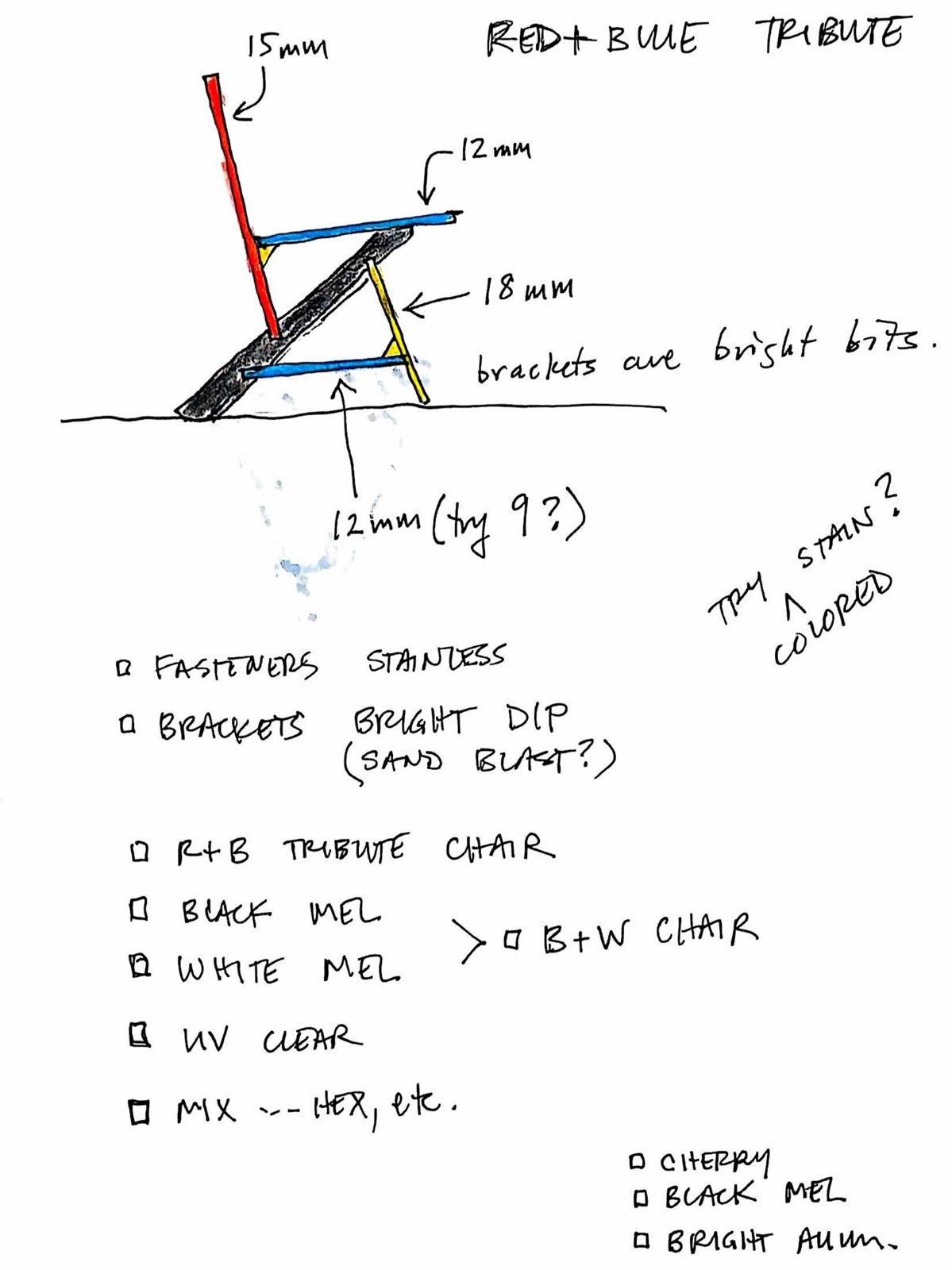
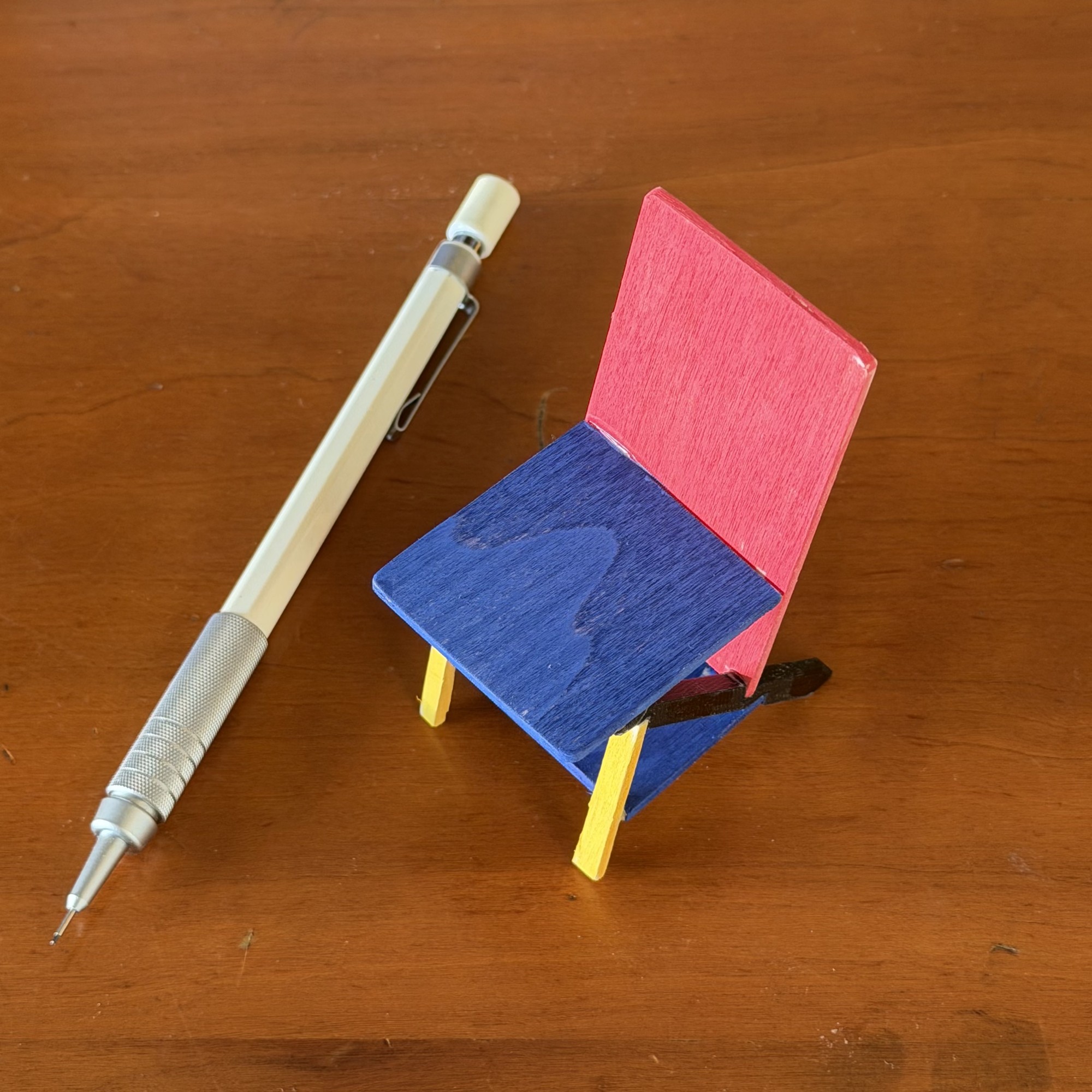
The notebook has the temptation on record. Early that September I drew the chair in the palette Rietveld put on his 1918 chair five years after building it, the back in red, the seat and tie in blue, the keel black, and titled the page a tribute, with a note that the brackets would be the bright bits. On the fourth I made one at a tenth scale to see the palette on an object instead of on paper. The yellow went onto the front legs, there being no brackets at that size. I have not built it full size and have not decided whether I will. It is the one drawing in the notebook where the color does the talking. The color is also the one thing on it I did not derive: the geometry is mine, the palette Rietveld's. Memphis invented its color outright; I reached for someone else's.
For a while I told myself the respectable argument was the whole of it. Under the tidy claim that the constraints already did the form-giving sits a second reason. It is not tidy at all. The chair is personal. It is one of the very few things I have made entirely by myself, start to finish, with no relay and no second room. I have proprietary feelings about it that I am not proud of and cannot quite argue away. I want this one to be mine. When I count the degrees of freedom and find them empty, I have to ask how much of that counting is honest engineering and how much is a man building a fence and calling it a theorem.
The uncomfortable part is that my own theory predicts I should call them. If function and form are nearly two different species of skill, then a lone maker who insists on doing both is exactly the kind of person who produces objects that work and are quietly, avoidably ugly. The relay exists because it usually wins. So my refusal is one of two things. Either it is the book's thesis coming true on my own bench, constraint having done the aesthetic work so thoroughly that the second room is empty, or it is ordinary ego wearing that thesis as a costume. From the inside, I cannot fully tell the two apart, and I am not going to pretend to. I am keeping the chair. I am telling you I might be keeping it for the wrong reason. Both are true at once. The version where constraint did all the work is the tidy one. I am not going to pretend it is the whole story.
One hard limit remains. That a look arrived from function does not make it good. Function can leave an ugly residue as easily as a lovable one. I cannot prove from the inside that mine landed on the lovable side. Of the triad, lovable is the one I can build toward and never deliver on command. I did not cheat toward it. I did not reach in and add charm once the structure was done. If the chair is lovable, it is lovable in the particular way of an object where nothing is applied and every line answers to something real. I trust that kind of desirability more than the styled-on kind. I could not have styled this one on if I tried. But this is where the project can still fail: whether the market, or you, or a stranger in a hundred years actually loves it is not something any argument of mine can settle.
I know the shape of the failure I am afraid of, because I read it once. As a young man I read everything Tracy Kidder wrote, starting with The Soul of a New Machine, and his book House held me like a thriller: would Bill Rawn, the architect, come to blows with Jim Locke and the Apple Corps builders? Pure prose narrative, and in my memory of it not a single illustration beyond an elevation or two of the finished house. And the house itself, when you finally step back from the story? A perfectly nice house. To my eye, not much more than what every 1850 farmhouse in New England already is. Nobody closes House and drives to Amherst to look at the building. That is the failure available to this book: I may have told an engaging story, and you may look up from it at the chair and say, meh. It is very hard to be objective about the beauty of your child.
Two things keep the fear useful rather than paralyzing. Neither is reassurance. The first is that this book, unlike Kidder's, never asks you to take the object on faith. The chair has been in front of you the whole time, in the drawings, in the photographs, in the pattern at full scale, and in the print edition under your thumb at the corner of every page. You have had every opportunity to say meh already. The second is that the Keel Chair is a pattern, not a commission. The verdict does not rest on my eye or on yours. Strangers will build this chair or they will not, and keep it or they will not. If the answer is meh, it will arrive not as a review but as data: a pattern nobody cuts. I have placed the bet in the one currency the question actually trades in. I have not retired that risk. I have doubled it.
One appearance I did choose, deliberately, against the grain of everything above. It is not a shape or a color. It is the mark. Having spent a book insisting that the chair should carry no signature of mine a stranger would ever need, I went and signed it anyway. The next chapter asks what a signature is even for on an object you intend to outlive you.
Checked against primary sources on 6 September 2026. THE PATENTS. Utility patent US 9,173,527 B2, "Ice cream scoop," filed 22 October 2014 and issued 3 November 2015. Design patent US D713,219 S1, filed 1 October 2013 and issued 16 September 2014. Both patents name the same seven inventors: Karl T. Ulrich, Jeffrey Allen Salazar, Alan J. Cook, Jeff Smith, Kevin John Augustyniak, Gerard Furbershaw and Kenneth D. Wood. Salazar, Smith, Furbershaw and Wood are Lunar people, and Smith and Furbershaw co-founded the firm. The seven-name roster on each is ordinary firm-filing practice and does not track who did what. The division of labor is KU's own account, given on 6 September 2026 as the owner of the company and a participant throughout: he made the rotated-scoop invention before Lunar was engaged, Lunar did the industrial design, and he weighed in on the ID without doing any of it. The subject matter of the two patents follows that split even though the signatures do not, and the text now says both things.
Lunar Design was founded in Silicon Valley in 1984 and later run out of San Francisco; McKinsey & Company announced its acquisition on 14 May 2015. The Belle-V scoop is listed in the SFMOMA museum store at forty dollars, checked 6 September 2026. Memphis: the group formed in Sottsass's Milan apartment in December 1980, not 1981, and launched at the Salone on 18 or 19 September 1981 with fifty-five pieces; the "over a hundred" figure that stood here is the count of drawings the group had completed by that February. The National Gallery of Victoria's wording is "Memphis rejected the restraint and recognised 'good taste' of functionally derived design" (Amanda Dunsmore, 19 October 2023). The Design Museum's is verbatim: "an exuberant two-fingered salute to the design establishment after years in which colour and decoration had been taboo." The Carlton room divider, 1981, wood and plastic laminate, is Metropolitan Museum accession 1997.460.1a-d, which the Met calls a Memphis icon combining "a space divider, bookcase, and chest of drawers." The Sottsass line is quoted by the Design Museum, which does not name its own source, so it is cited as quoted rather than as read.
Loewy's phrase, most advanced yet acceptable, is confirmed by the Loewy estate; the typicality-and-novelty construct built on it is Hekkert, Snelders and van Wieringen (2003) and is now attributed to them rather than to Loewy. The intuitive-physics claim is presented as the author's hypothesis, because no study linking stability perception to aesthetic preference could be found; the physics-engine literature behind the first half is Battaglia, Hamrick and Tenenbaum, PNAS 110(45), 2013, and the nearest established mechanism for the second half is processing fluency, Reber, Schwarz and Winkielman, Personality and Social Psychology Review 8(4), 2004. The rest of the aesthetics theory, elegance as complexity resolved, wow as novelty resolved, honest signalling after the hand-axe literature, is from the author's chapter "Aesthetics in Design," a working draft for the second edition of Design: Creation of Artifacts in Society.
Rietveld's Red and Blue: the chair was built in 1918 in uncoloured stained beech and did not receive the primary-color scheme until about 1923, so the text now dates the palette rather than the chair. Kidder: House (1985), architect Bill Rawn, builders Apple Corps with Jim Locke the partner in charge, the house on four acres in Amherst, Massachusetts, all confirmed; the recollection that the book carries almost no illustrations is the author's memory of his edition and is stated as memory. The Soul of a New Machine, 1981. Ben and Jerry's purchase and the author's ownership of Belle-V are his own account.
A chapter of The Hundred-Year Chair, drafted and refined in public. The same text lives in the book; the interactive tools and the fully-sourced technical notes live here. home · the book · the technical notes · hundredyearchair.com